Carta
Designing the course search experience at Stanford University.
Role
UX/UI Designer
Duration
January - June 2021
Location
Stanford, CA
User Interviews
I began by conducting user interviews through Zoom and screen-share in order to uncover insights about the search experience on Carta. I asked questions such as:
- When and how often did students search?
- What are their main goals when searching for classes?
- How did they narrow down their list of classes?
Findings
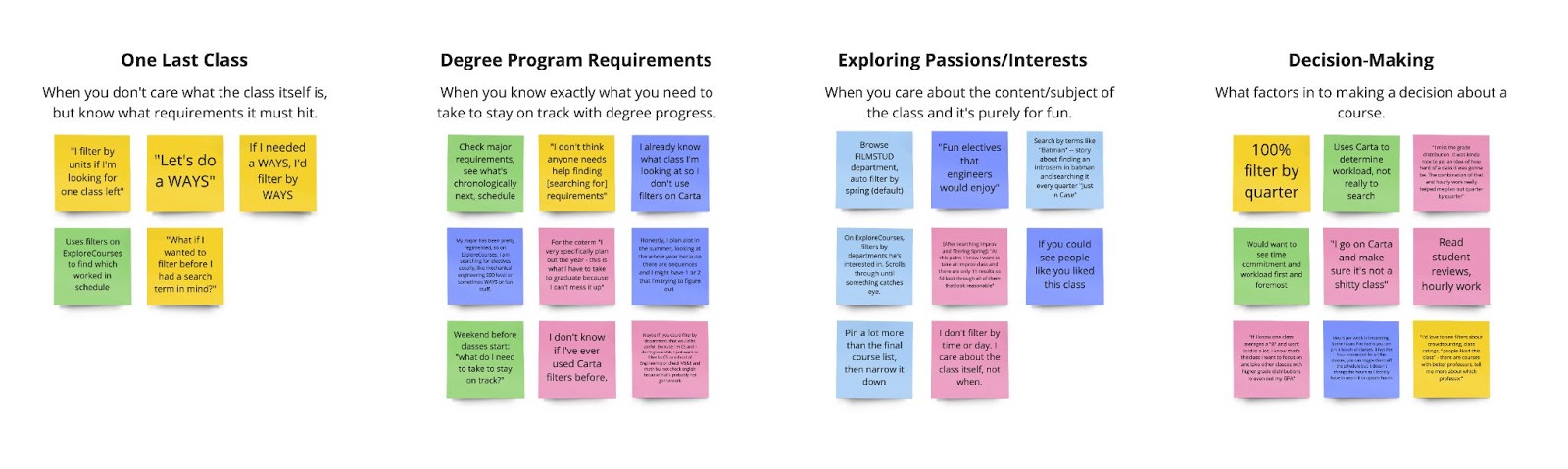
I found that students often entered exact-string queries courses because they knew what they were looking for. This was a common case because students just wanted additional information about the courses required by their degree programs.
However, another compelling use case for filters among students was in finding one last course - a filler course to complete their schedule. The most frequent behaviors in this scenario were narrowing results by quarter, number of units, and fulfillment of graduation requirements (WAYS requirements).
Degree comes first.
Most of the time, students know exactly what course they need to take in order to stay on track to graduate from their degree program.
One last class.
Other times, students need just one class to round out their quarter based on some requirements, such as WAYS, units, or even time of day.
Comparator Audits
Next, I found analogous search experiences to help explore and understand different search flows a user might take. I considered uses cases for how filters were updated, how additional filters were displayed, and how search results were surfaced and categorized.
These helped inform some of my initial low-fidelity mockups, as I explored different filtering, search results, and search bar interactions.
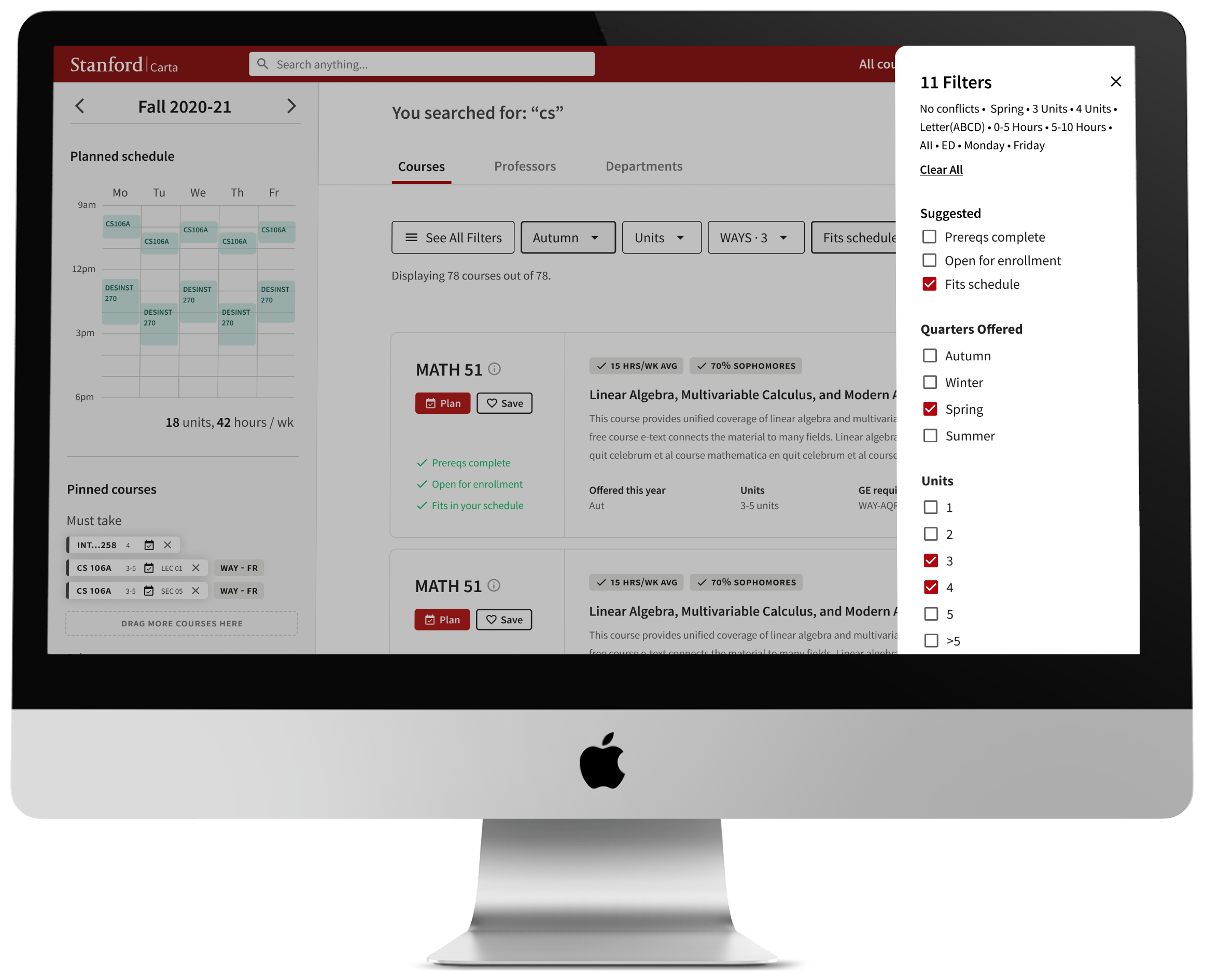
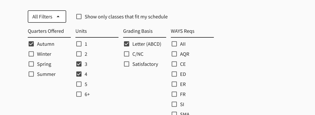
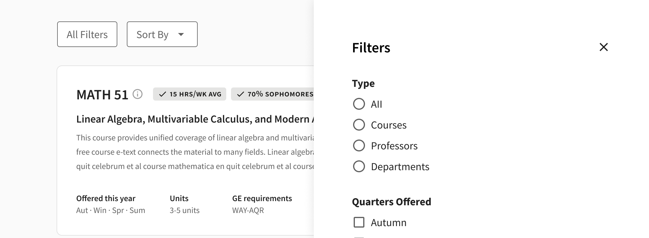
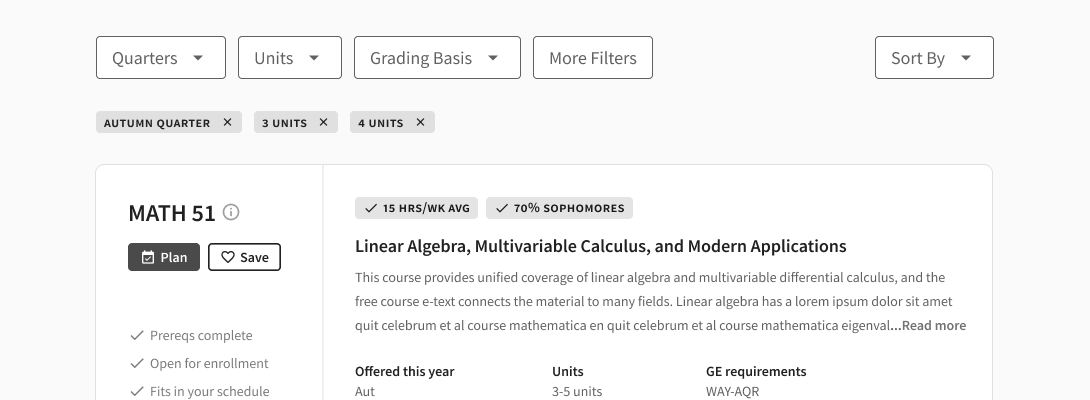
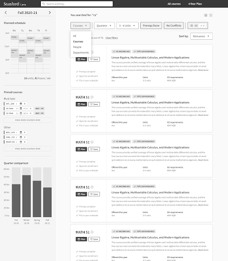
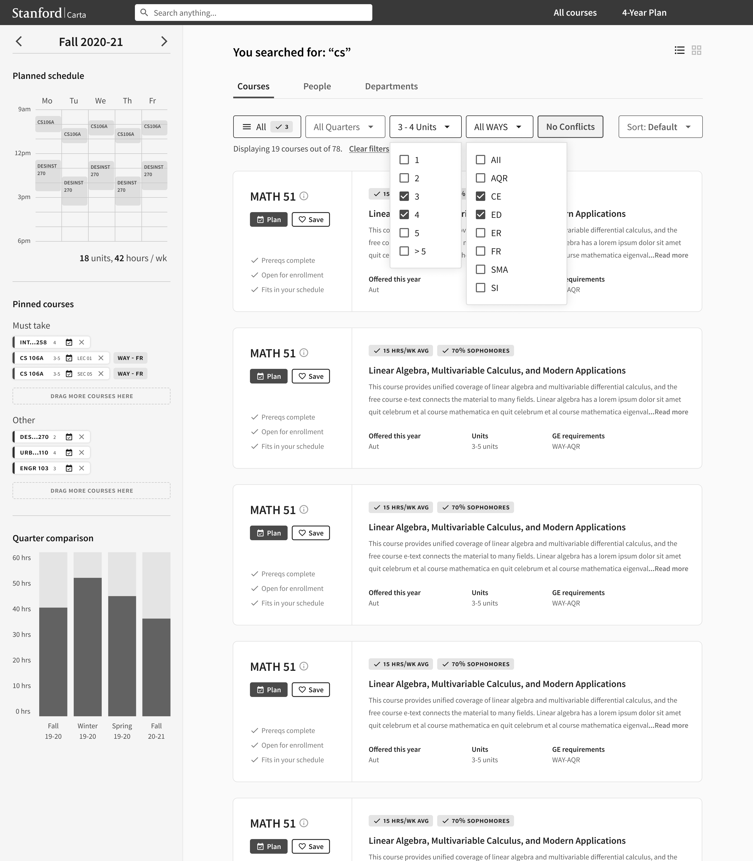
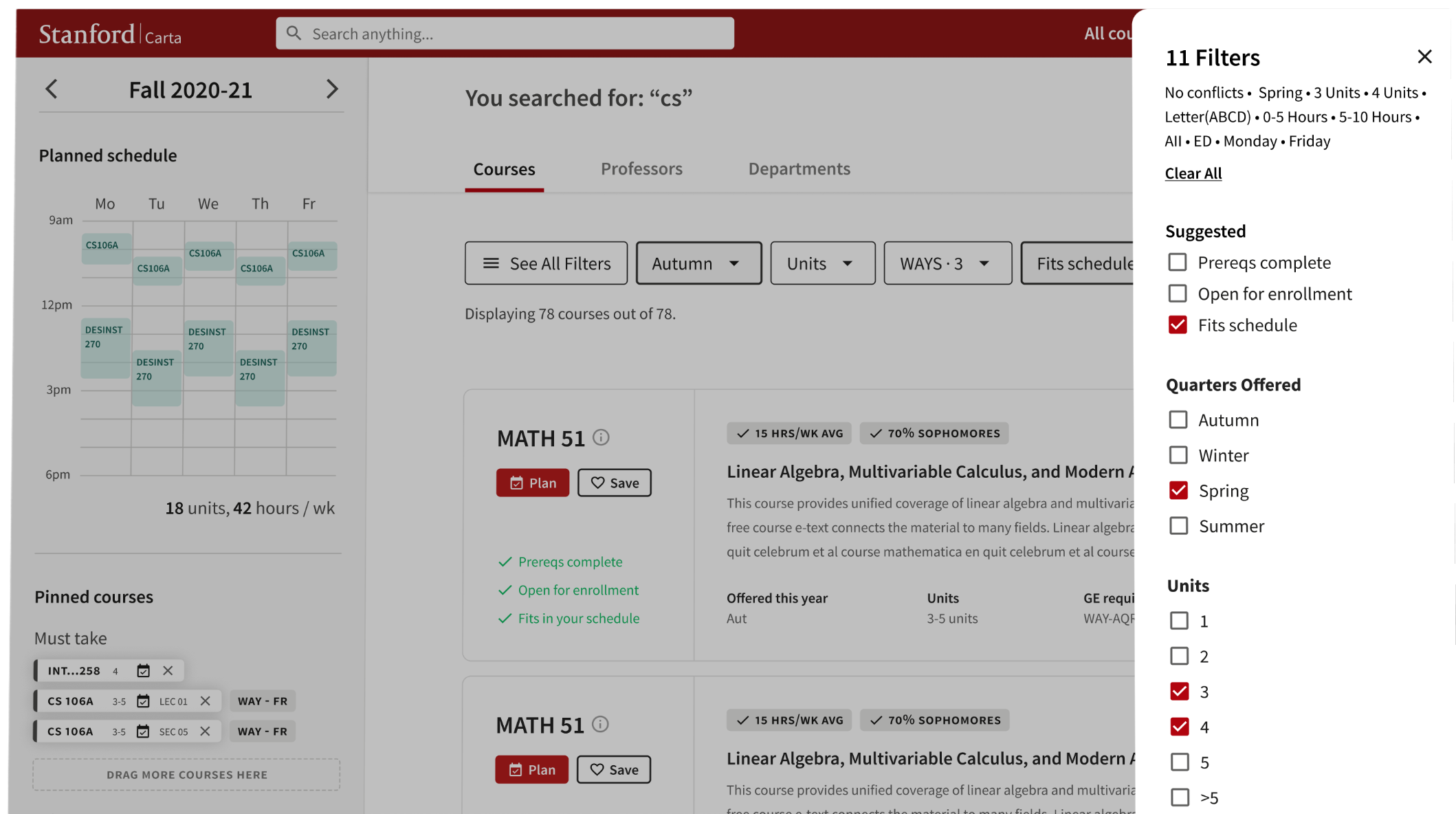
Filtering
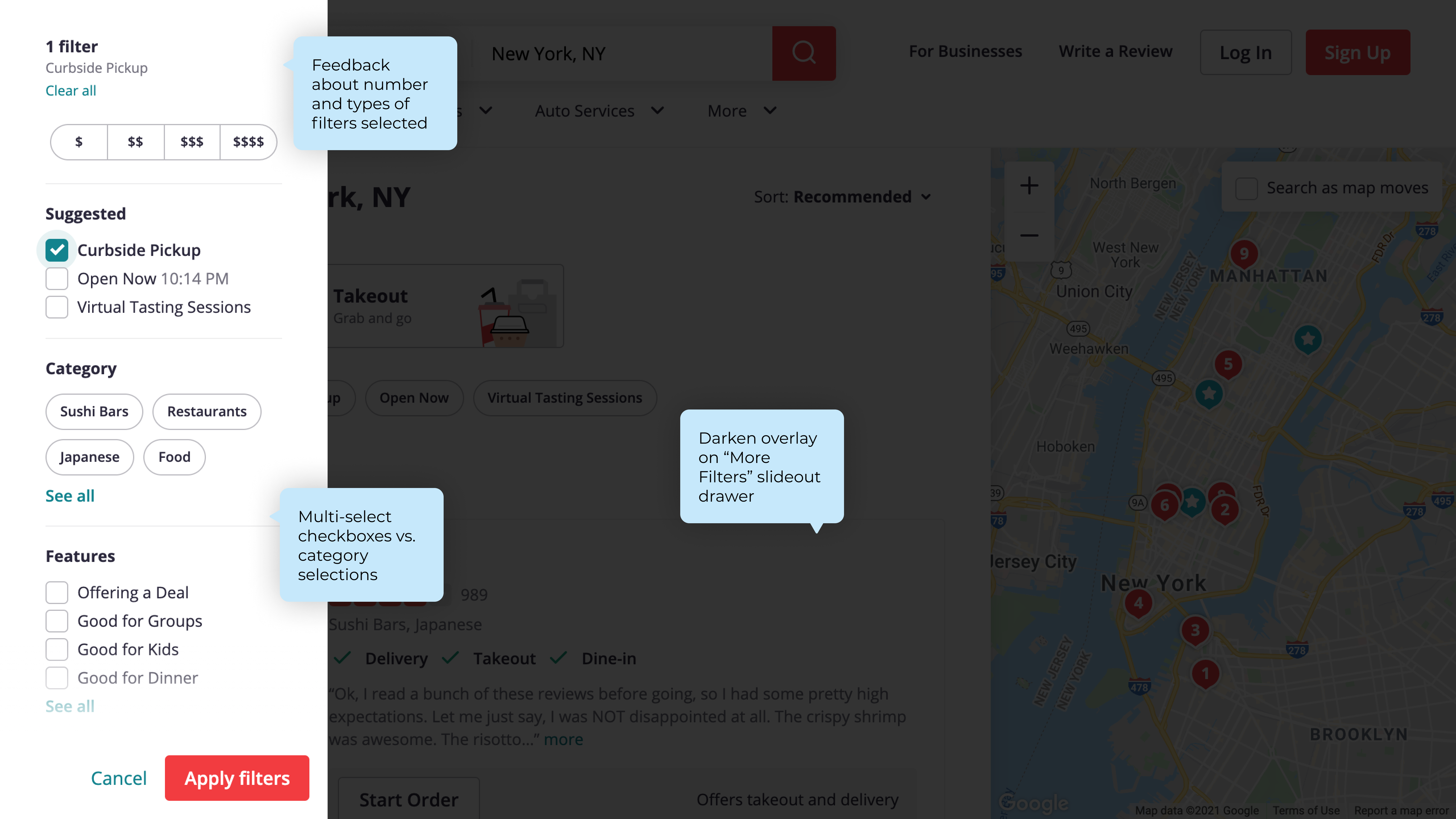
I considered multiple ways of representing the information hierarchies implied by filters. In one version, I tried out a collapsible panel at the top of the page. In the second, I explored a slide-out drawer. In the third, I tried out a row of dropdown selections and additional filters in a modal.
My fellow designers and I evaluated the merits of each approach. Liam and Kaelyn appreciated the way a row of relevant filters gave users context for their search, and noted that the first two variations were lacking this context. Jordan and Kaelyn were cautious of using a popup modal, since it had the reverse effect of bringing the user out of context - it might have been too jarring, especially because it covered the underlying search results.
I took my team's feedback and decided on a hybrid approach that used dropdown selections for the most-used filters, alongside a "More Filters" button that would open up a side panel drawer. Of note, I also focused on giving users feedback on which filters they selected, including a thorough consideration of ways that active/selected states can be leveraged to show which filters were applied.
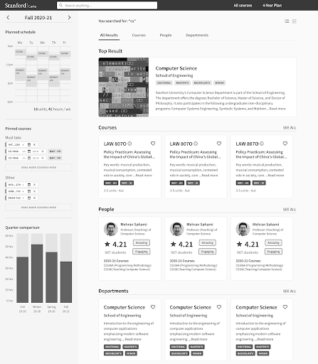
Navigating Results
One peculiarity of Carta search results is that there are multiple types of results: courses, professors/teaching staff, or even departments. Tabs were a natural consideration since they would be used to logically chunk results that were parallel in nature. Additionally, they were already used throughout other pages on Carta. Shoutout to Liam for sharing a great article from Nielsen Norman Group about using tabs that helped inform this approach.
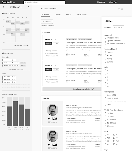
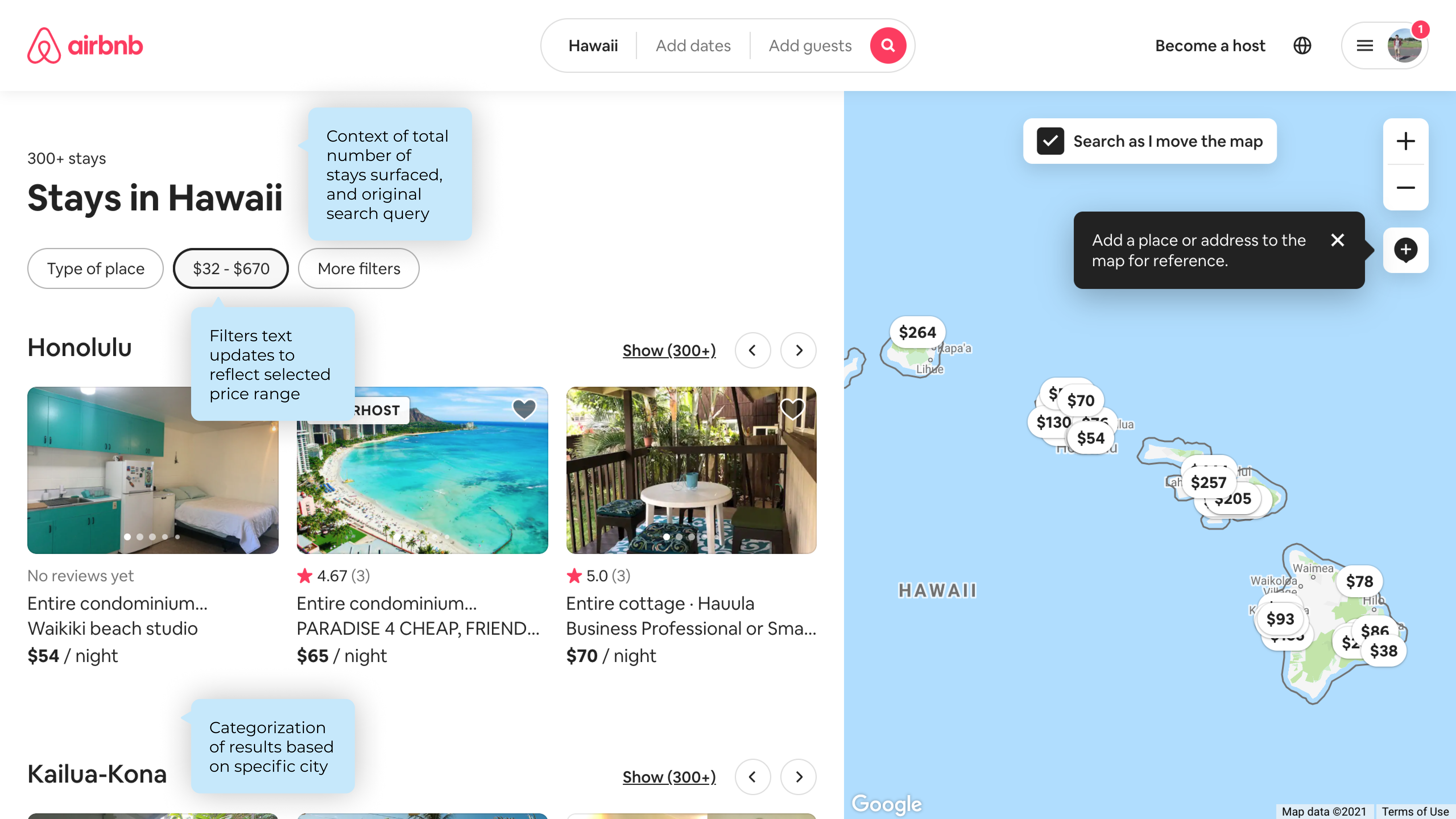
I explored a grid layout more geared towards exploration and recommendation rather than filtering. This was inspired by Spotify's analogous search patterns and was an interesting case study of breadth vs. depth of results.
I also tried using buttons (inspired by LinkedIn search) to navigate between result types. LinkedIn provided a great comparison with search results spanning companies, job opportunities, people, posts, and other categories. Exploring this pattern gave me insights about how filter sets could be dynamic depending on the type of result a user is looking at.
Putting it All Together
A major design decision I made was to remove the "All Results" tab. Since our research showed that students are searching for courses in the majority of cases (~90% of the time), it would reduce friction to just display the courses as a default.
Since showing an "All Results" tab would always require students to have to specifically switch to Courses, or People, or Departments to see more, I decided that removing this would bring them one step closer to an intuitive and efficient search flow, without sacrificing the experience.
Design System
I made sure that I was using all patterns, components, and colors consistently within our design system. Then, I linked up the interactions into a fully-functional, usable prototype that would help the hand-off process to the development team. I also included commentary on expected behaviors for the flows, including cases for null results, different search queries, and peculiarities in filter criteria.
Takeaways
This was my first time working on a real, structured design team, and I am incredibly grateful for the opportunity. I wouldn't want to have had my first structured design critiques, brainstorming sessions, and design banters with anyone else - so huge huge shoutout to my design team: Kristina, Liam, Jordan, and Kaelyn.
I was surprised by both how much I knew, and how little I knew, of the design process. Sure, I'd heard of and practiced needfinding, brainstorming, and prototyping before. However, I didn't realize how many wild and exciting directions design could take me, with a feature as seemingly straightforward as filters, no less! I am excited to continue applying what I've learned to future design - and even engineering - projects.
Be unafraid to ask for help.
Stay anchored with the user end goal.
A supportive design team is one of your greatest design tools.