Goodreads
Redesigning the world’s largest site for readers and book recommendations.
Role
UX/UI Designer
Duration
March 2021
Location
Home
Background
Goodreads is the world’s largest site for readers and book recommendations. According to the Goodreads website, its mission is to help people find and share books they love.
Instead of roadtripping through Joshua Tree and Death Valley for spring break this year, I decided to embark on a different kind of journey - a UX/UI case study and redesign of Goodreads. Over the course of one week, I researched, tested, and prototyped a reimagined mobile experience for Goodreads. This project was not endorsed by, directly affiliated with, maintained, authorized, or sponsored by Goodreads.
Research
My first step towards better understanding the ways in which readers currently use the Goodreads mobile app was conducting user research. Due to COVID-19, I decided to take a digital approach, turning to Reddit as a method of crowd-sourced needfinding. I read through a handful of recent threads in which Goodreads users vented about frustrations they found with the platform.
In addition to gathering insights from Reddit forums, I also reached out to friends that I knew were active on Goodreads. This allowed me to have more in-depth conversations about painpoints, joys, and behaviors within the app. I distilled important learnings and quotes from this combination of crowd-sourced and individual interviews and then categorized them using affinity mapping.
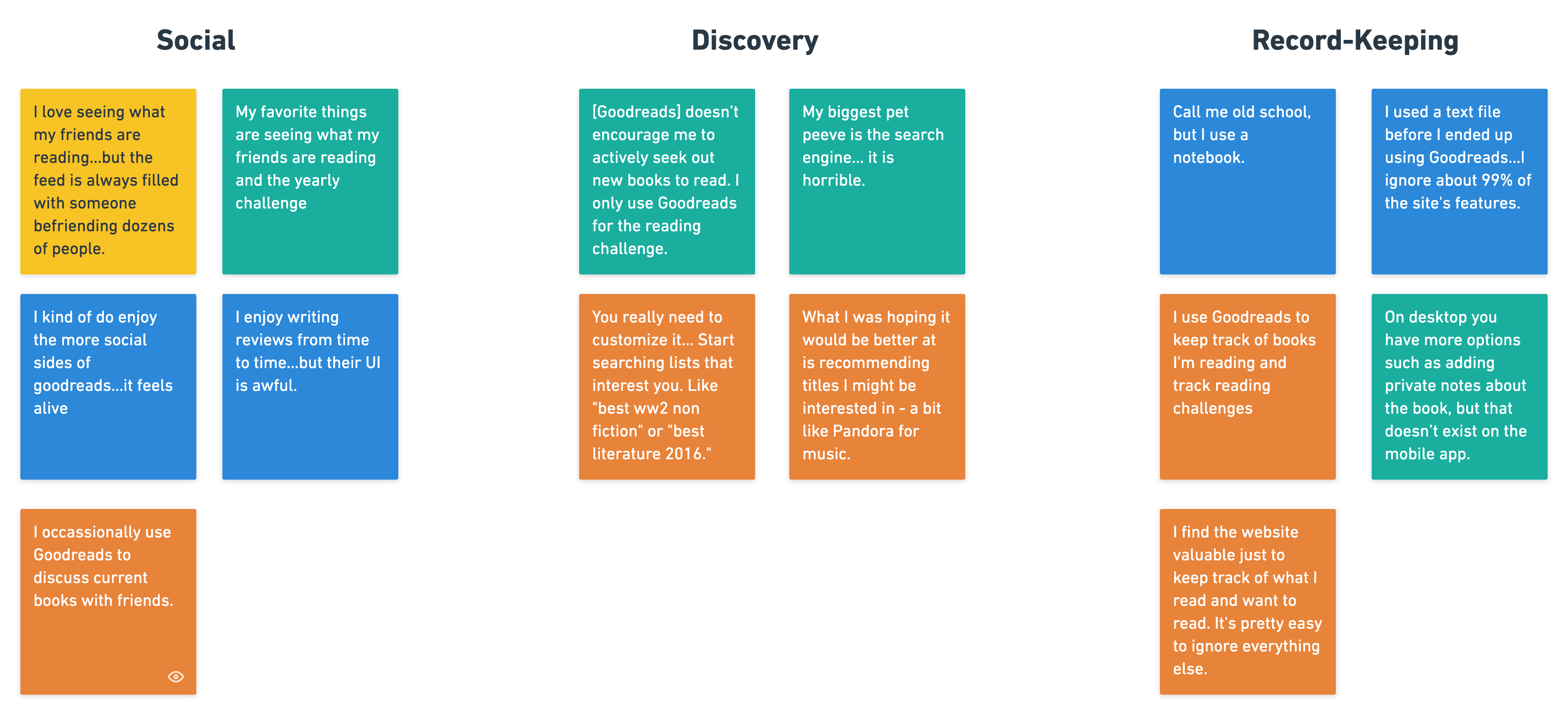
Beyond qualms with the clunky interface of the current Goodreads mobile app, I identified two themes to the user feedback. The first was a tension between being social on the app and engaging with friends' reading activities, and wanting to purely track personal activity. The other was a frustration at the limited emphasis Goodreads placed on discoverability of books.
Social aspect of Goodreads contribute positively to the reading experience, but there is a tension between public and private reading activity.
While Goodreads has plenty of these resources to support personalized exploration and recommendation they are obscure and underutilized.
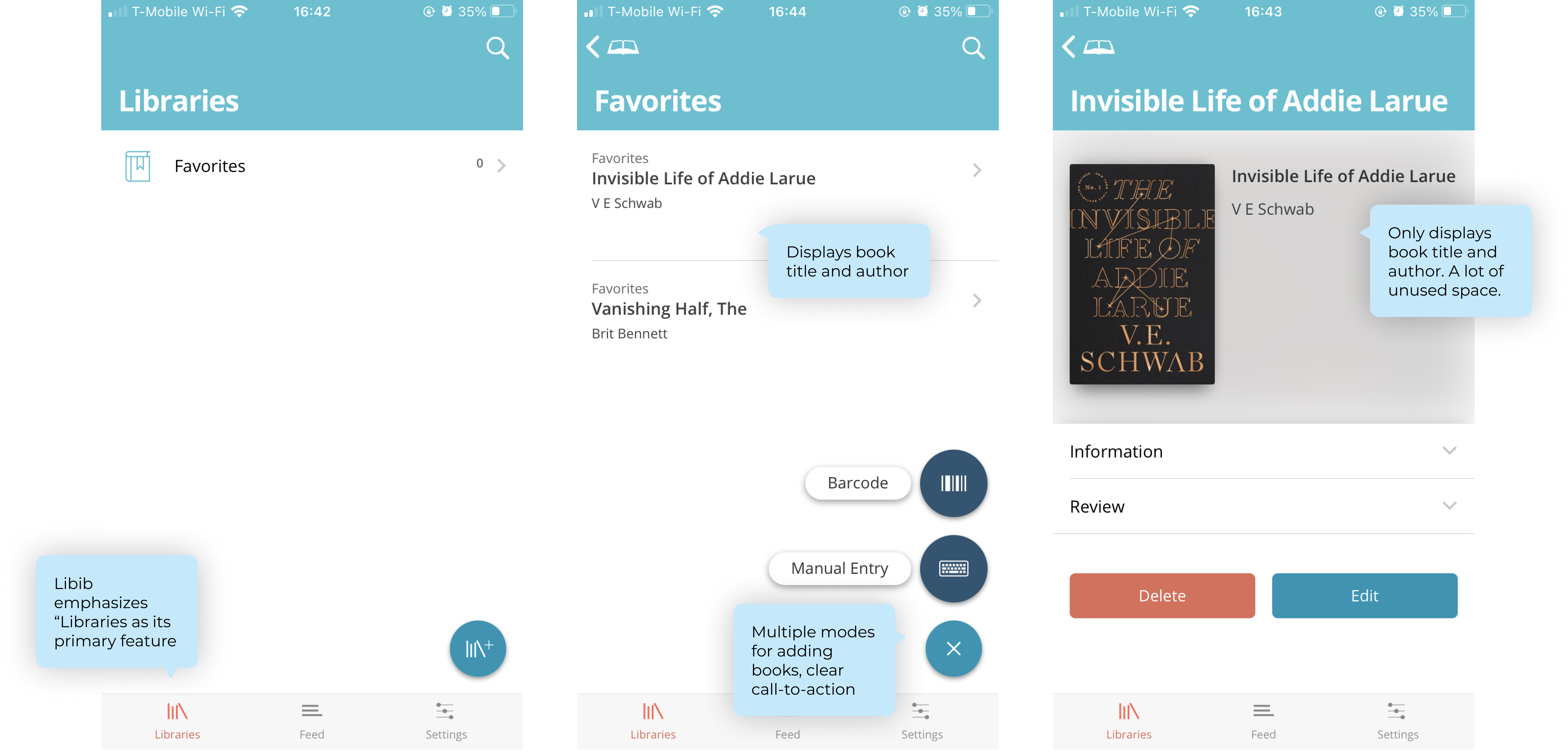
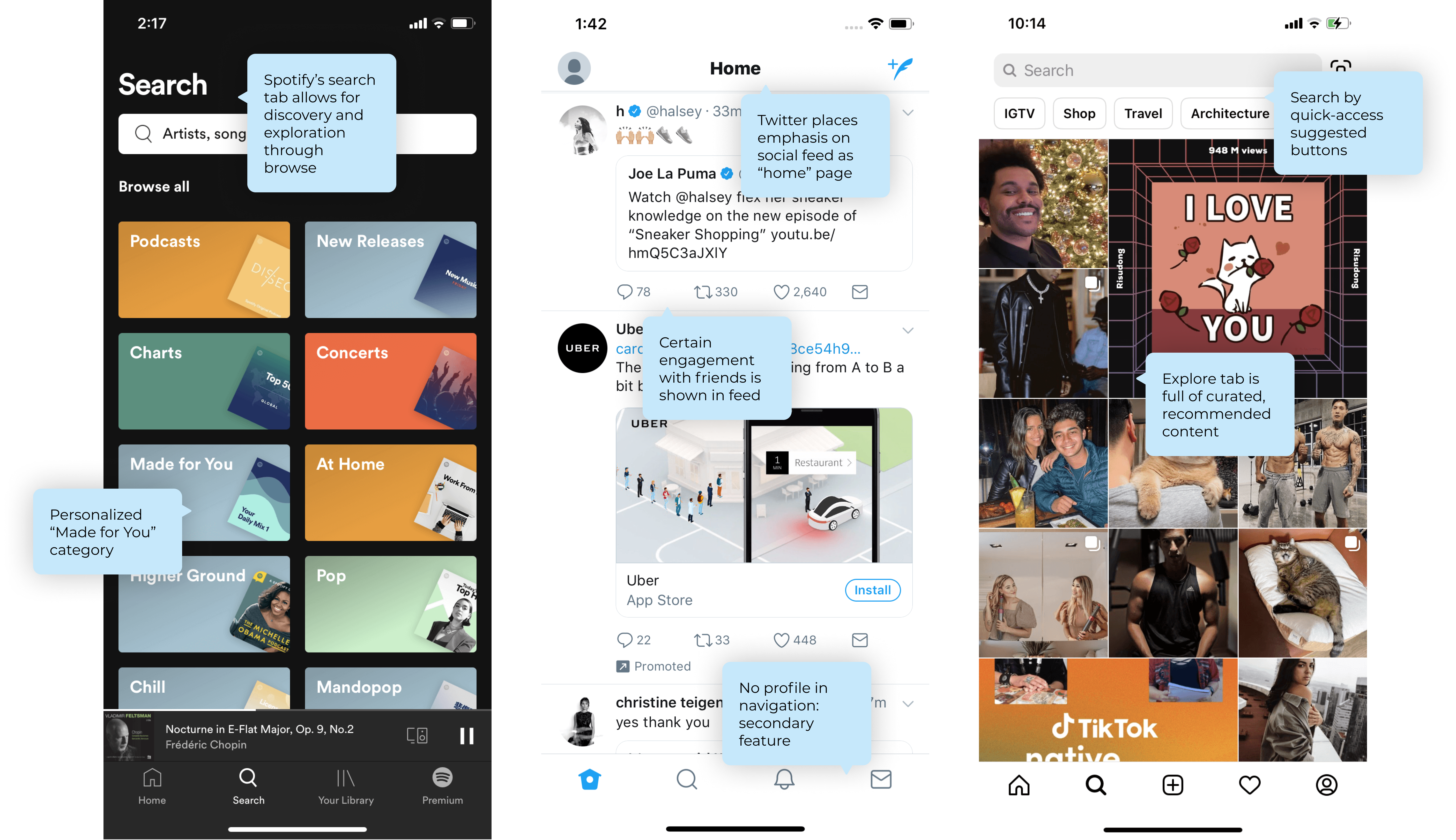
Comparator Audits
After my preliminary research, my next step was to conduct comparator audits of similar apps and UX patterns found in Goodreads. I looked at both existing reading app competitors such as Reading List and Libib, as well as apps in different domains but with similar patterns, like Spotify's explore flow and playlist library and Twitter's social feed. Below are some annotated screenshots of my comparative analyses.
My user research, affinity mapping, and comparator audits provided the groundwork to explore basic grayscale wireflows to tackle the painpoints and opportunity spaces that I uncovered. I approached my ideation and prototype stage by focusing on the three categories identified in the user research: social, discovery, and record-keeping.
Social
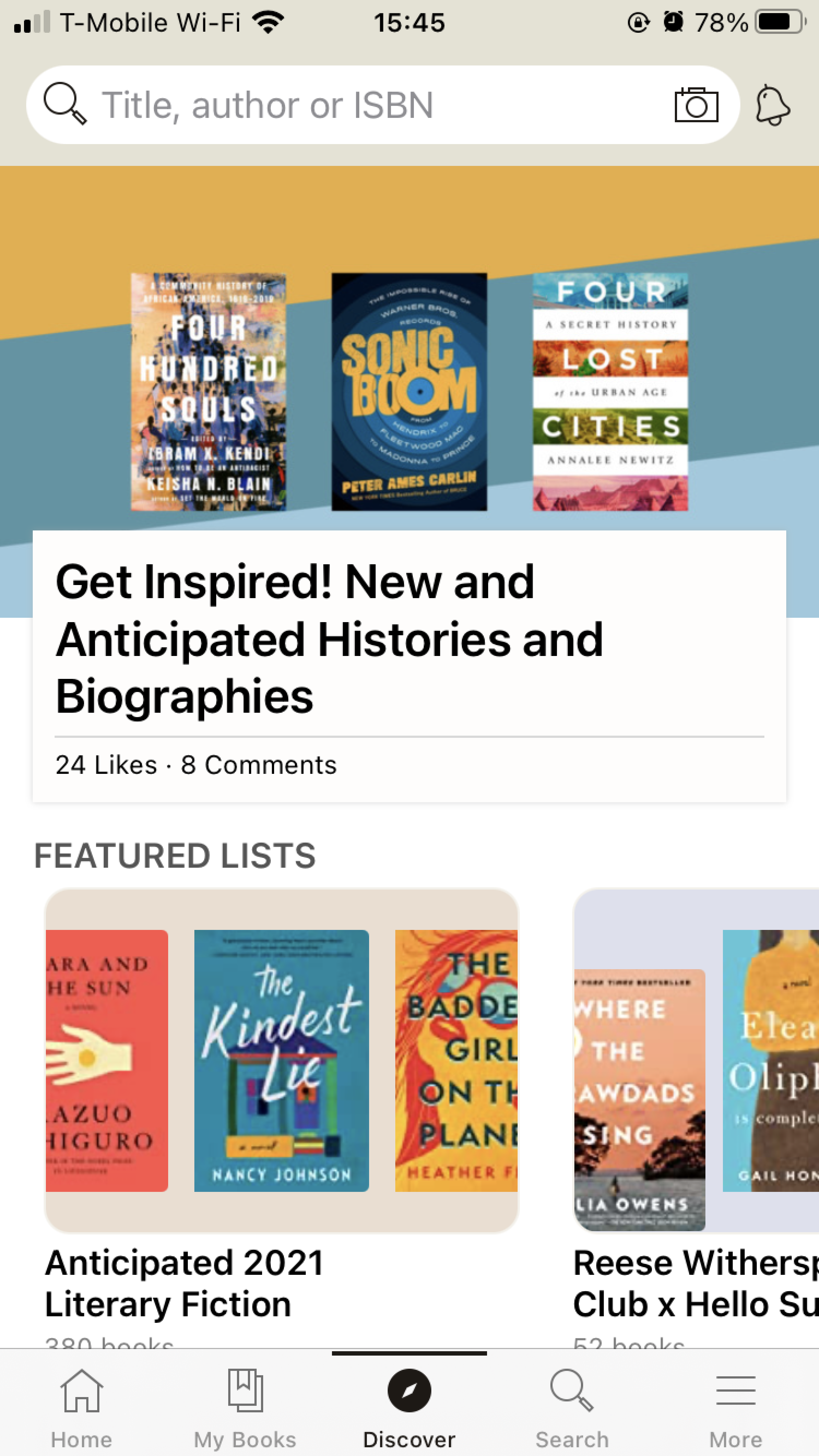
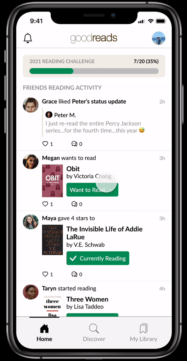
The current Goodreads app opens to a home screen that attempts to do it all: there is a search bar to look up books by title, author, or ISBN; there are social updates from friends' reading activity; and there are recommendations from Goodreads based on your reading history. This is confusing to the user because there's no clear primary function of the home page!
My social explorations aimed to provide focus to the homepage. If it was to be social, then I believed I could better leverage the social aspects of reading that Goodreads users loved. Thus, one flow I explored was an activity feed that could be toggled between self-view and friend-view (a la Venmo). Here, the focus is clear: the homepage is a hub for engaging with readers, and there is a clear distinction between what is yours versus what is your friends'.
I also explored a flow in which the homepage served mainly for personal discovery. In this version, social activity is not present at all on the homepage, and instead are accessible through the user's profile (and consequently, friends). Instead, the homepage gives recommendations and easy entry points to discover genres and books.
Discovery
Currently, the Goodreads mobile app has one navigation item called "Discover" and one for "Search." Yet the "Discover" has absolutely no personalization based on user reading history whatsoever -- if the user wanted to get curated recommendations, they would have to go to an obscure page within their profile called "Recommendations." Bottom line? Discoverability was a heavily underutilized feature that users wanted but could rarely find easily. Additionally, having both "Search" and "Discoverability" felt like a redundant pattern that cluttered the navigation bar and offered little extra utility for users.
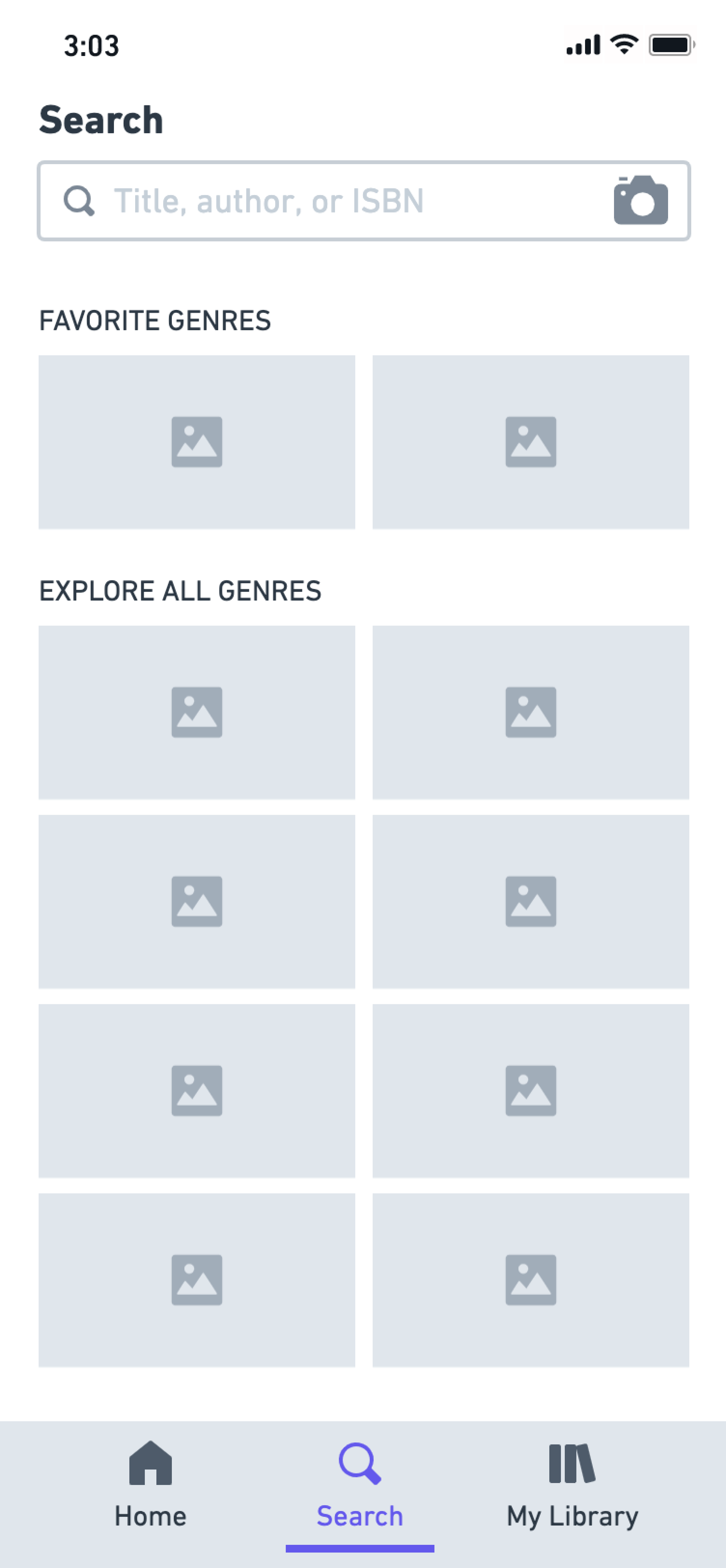
Thus, my medium-fidelity explorations for discovery aimed to make use of personalized content and easy discoverability.
Record-keeping
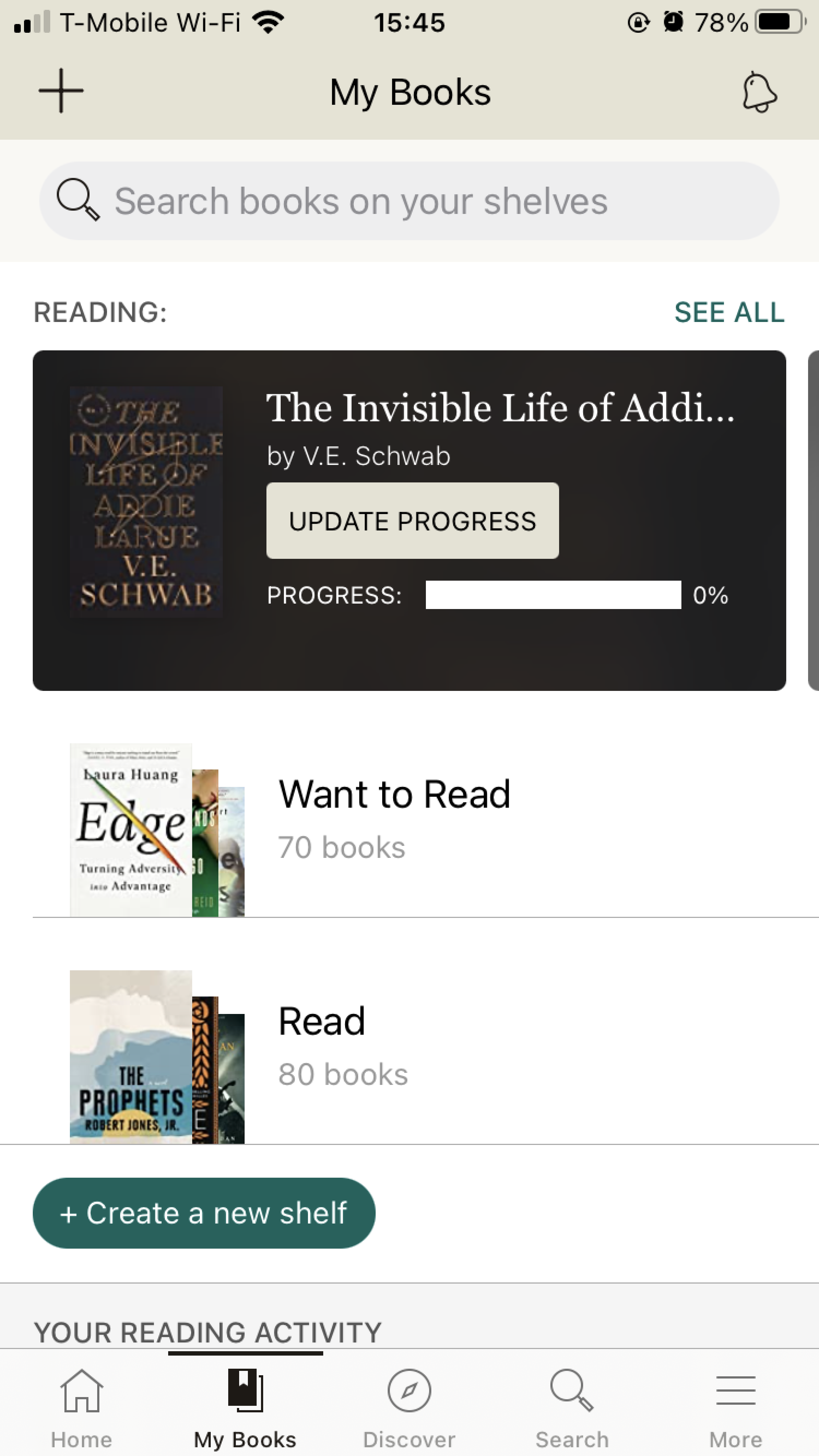
One of the most-used features for users of Goodreads is to keep track of reading history, including books they're currently reading and books they want to read. Simplicity is key in this interaction, since tracking books happens frequently.
The existing Goodreads app makes it surprisingly difficult and unintuitive how to add books to a collection. For example, within a "shelf", there is no explicit call-to-action for users to add books. This process is hidden in the three-dot menu at the top right corner of the page. Additionally, while there is a way to search for books within all shelves at once, it's impossible to search for books within a particular shelf.
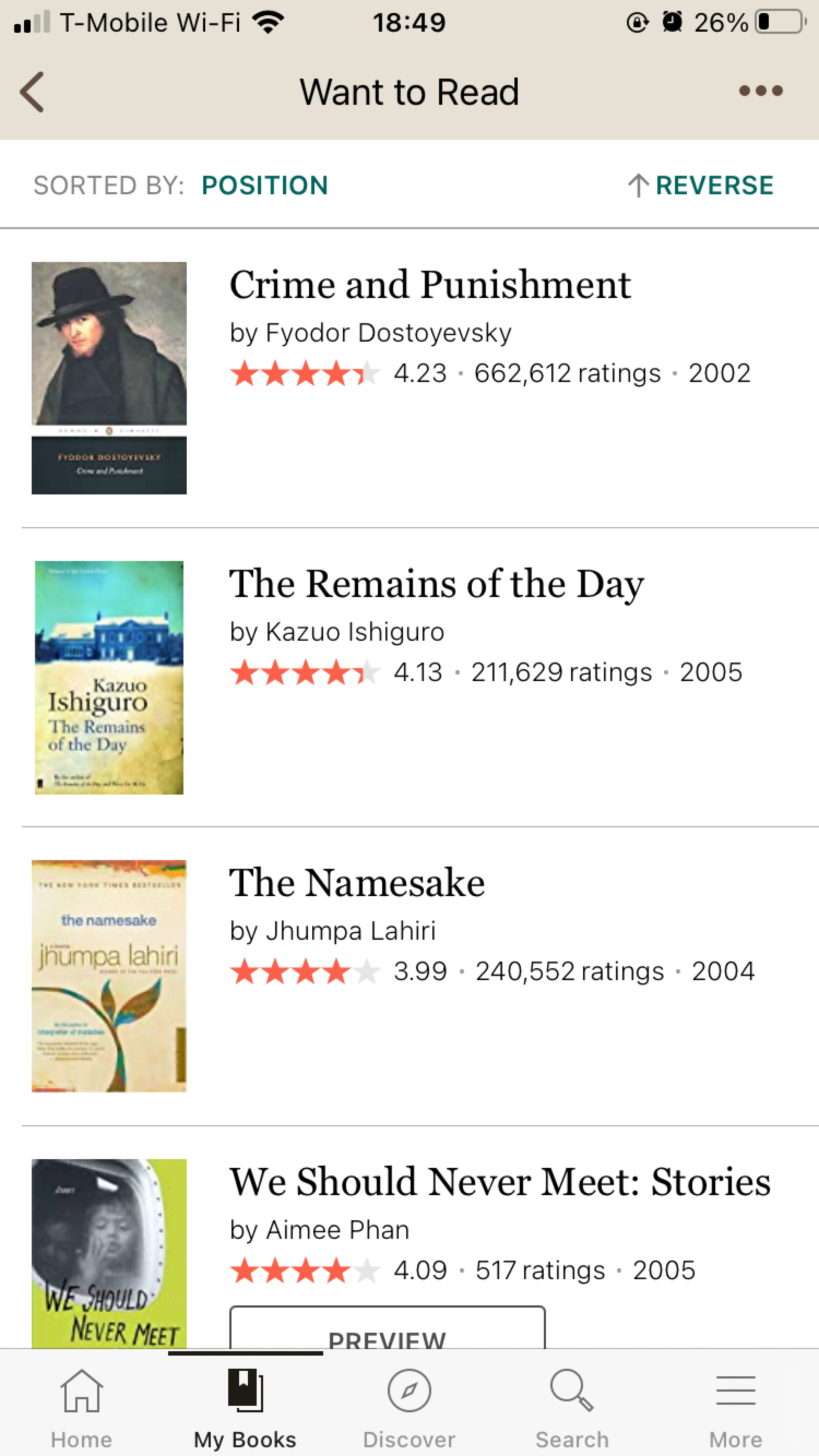
My explorations sought to simplify the user's library, making it easier to navigate, view, and modify collections. I also explored how to make it more explicit what content was private versus what was public, since my research found that people were often confused.
High-fidelity Prototype
My main visual goals and principles for this Goodreads redesign were: simplicity, discoverability, and efficiency. How could I convey a clean, intuitive interface for users to accomplish the goals that I uncovered through my user research and wireframe explorations? Sticking to these principles helped me to make higher-level decisions about how to best convey information in an easily-recognizable manner.
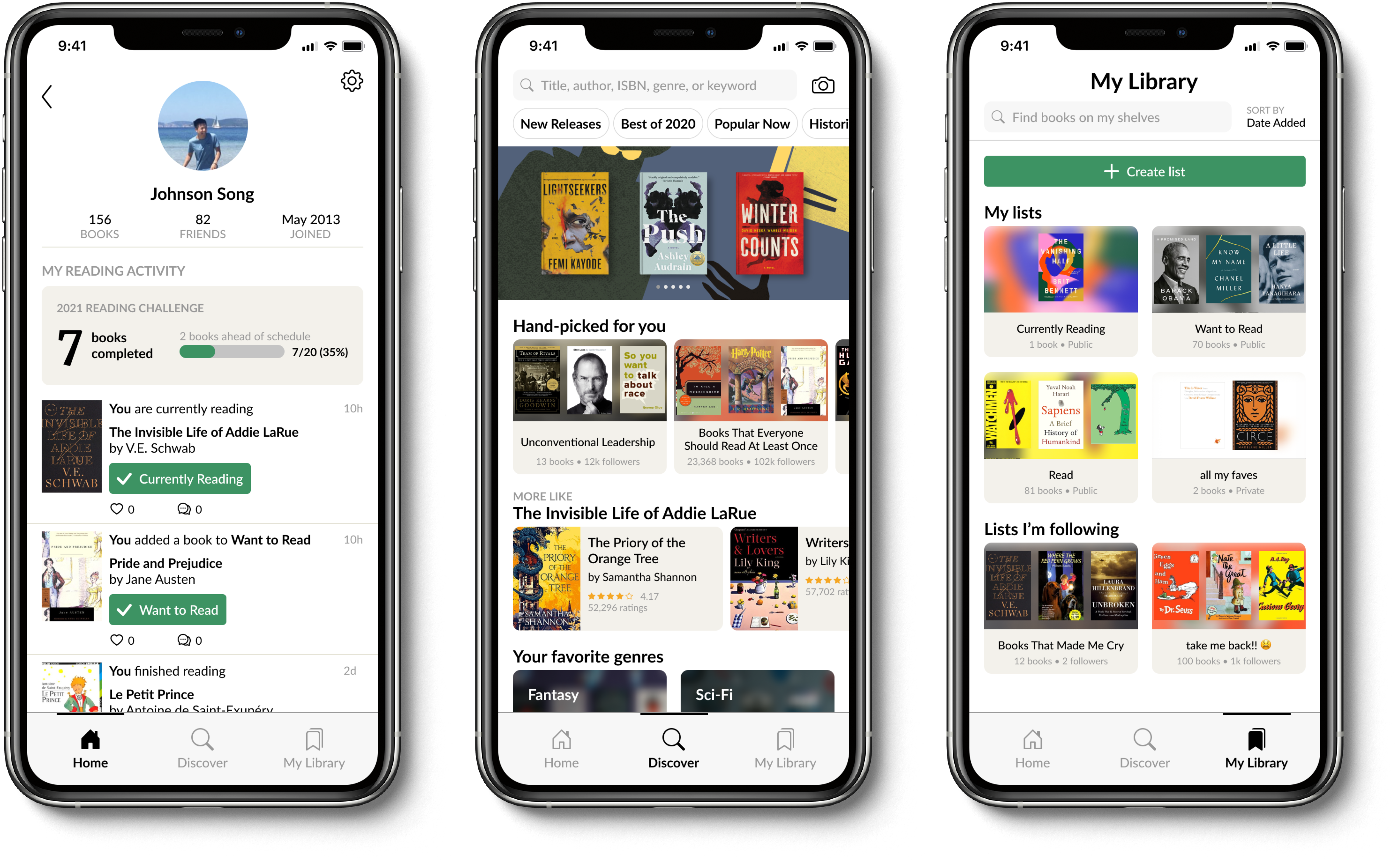
My final homepage design intends to clearly delineate the social aspect of Goodreads with a purely social feed of friends' reading activity. The old search bar is replaced with a way for users to access their personal profiles, where they can easily see all their personal reading activity. This is supported by the decision to simplify the Goodreads navigation to three top-level items (home, discover, and library), rather than the original five. Additionally, I gave the UI an update to feel sleeker while maintaining the recognizability of previous components.
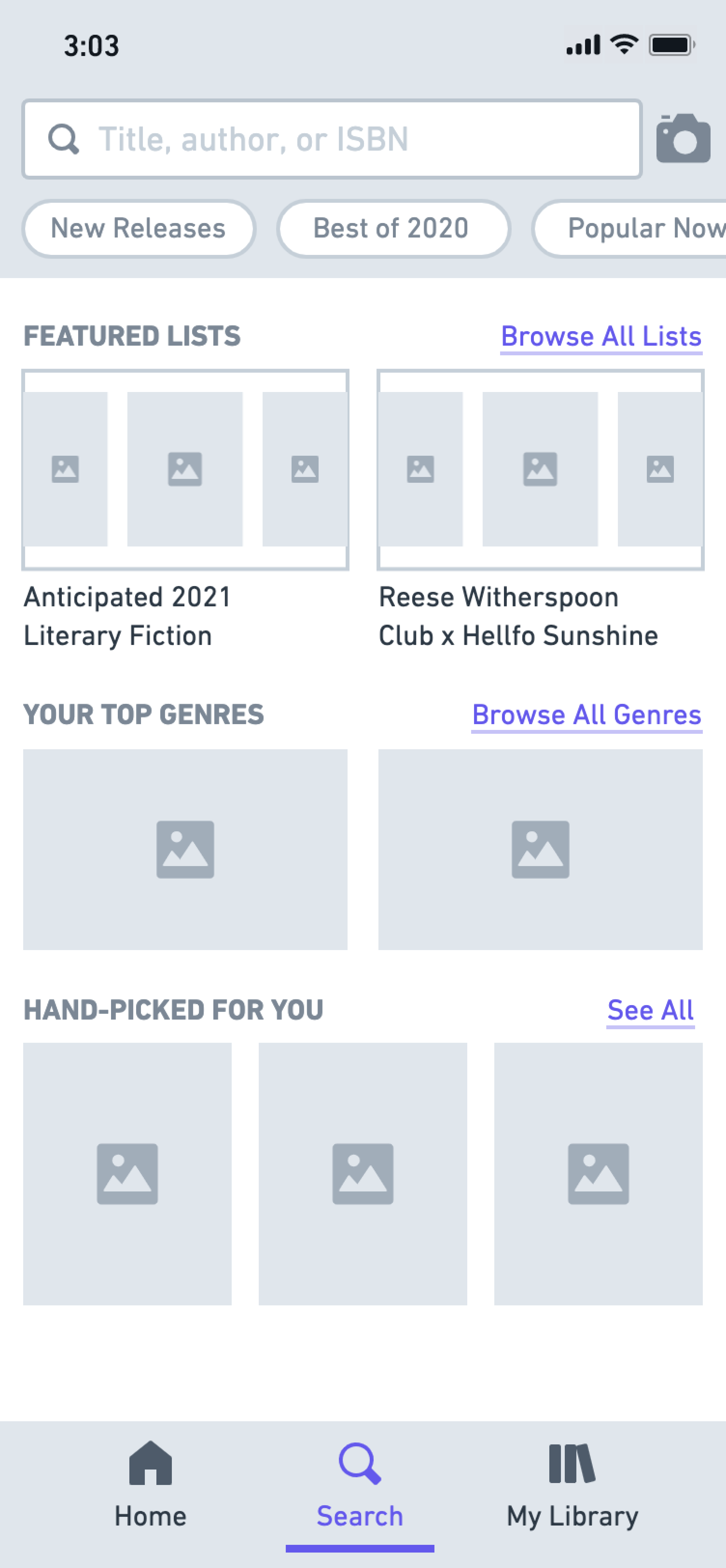
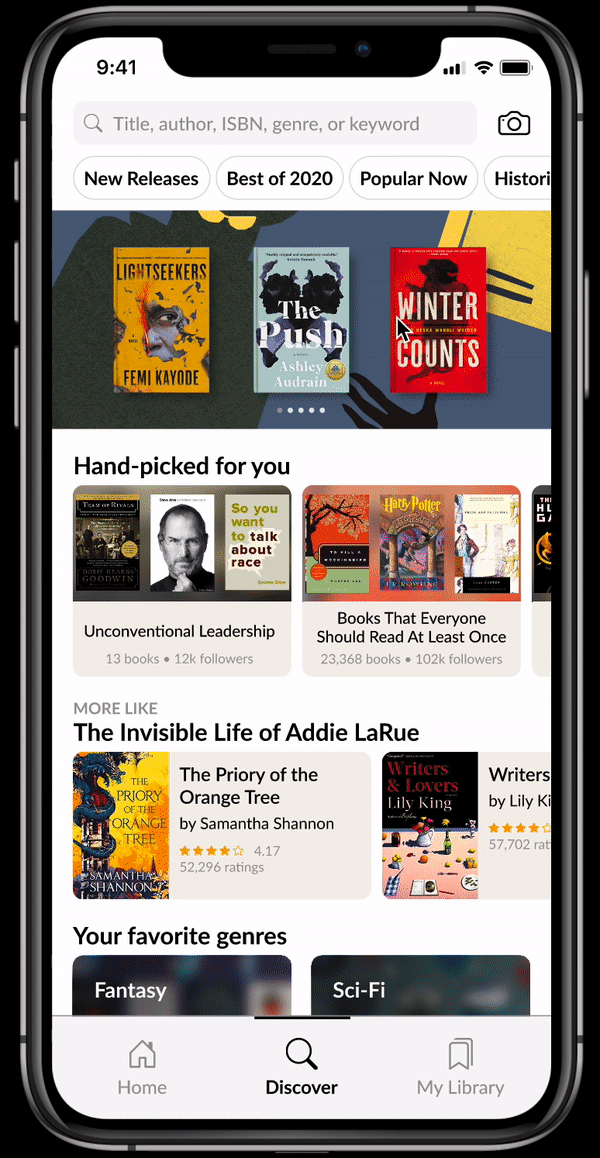
My redesigned discover page allowed me to get creative with visual treatment. Starting from the top, I included a row of searchable tags with keywords and genres for easy access. Under it, I created a scrollable banner to show off the featured books/lists and any announcements from the platform. This was a good way to differentiate this highlighted content versus the rest of the page. Then, instead of having only a list of static genres like the existing Goodreads app, I wanted to make the discover page more personalized and curated. This manifests in a "Hand-picked for you" section of lists recommended to each user. Then, there is another horizontally-scrollable section for recommended books based on ones that the user has enjoyed recently. Underneath, the user can then browse and explore generic categories, like genres.
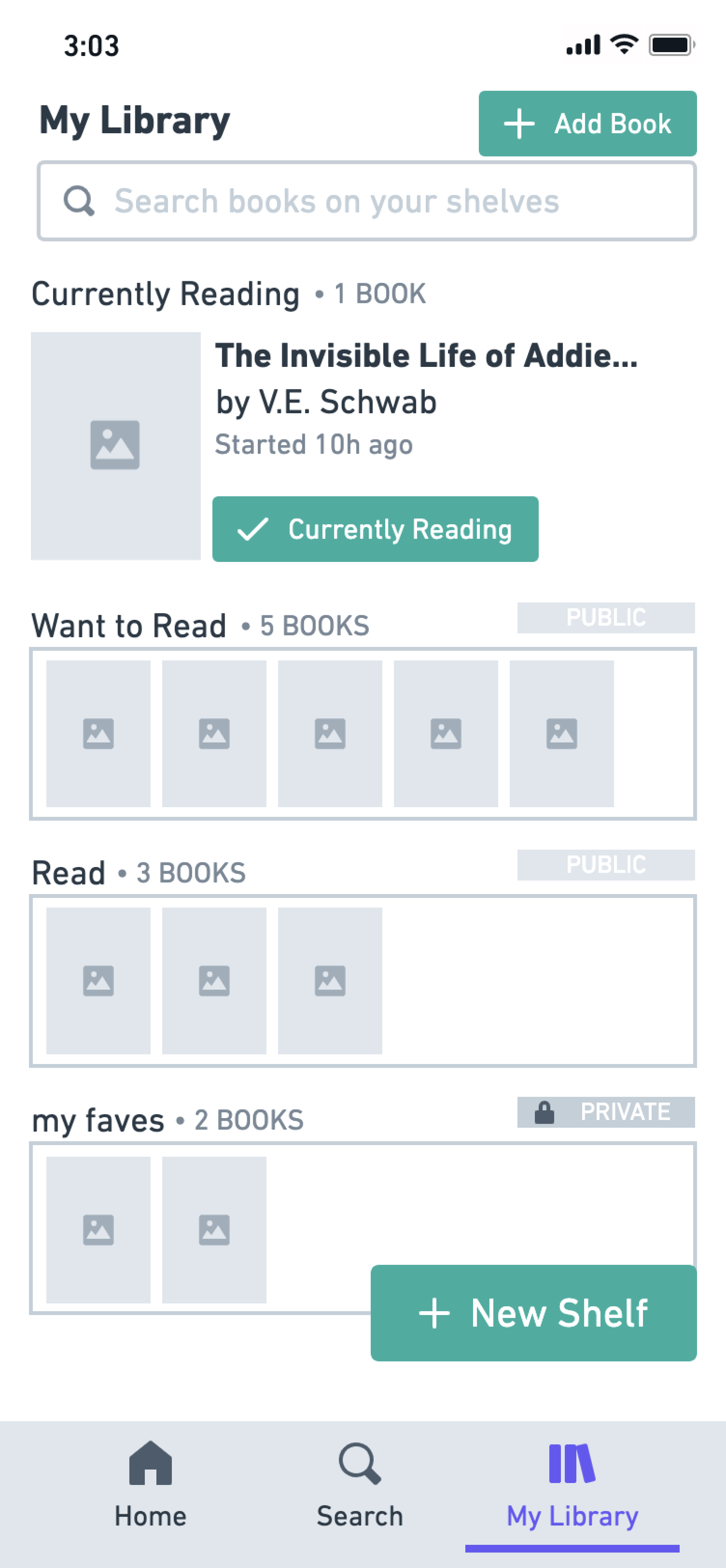
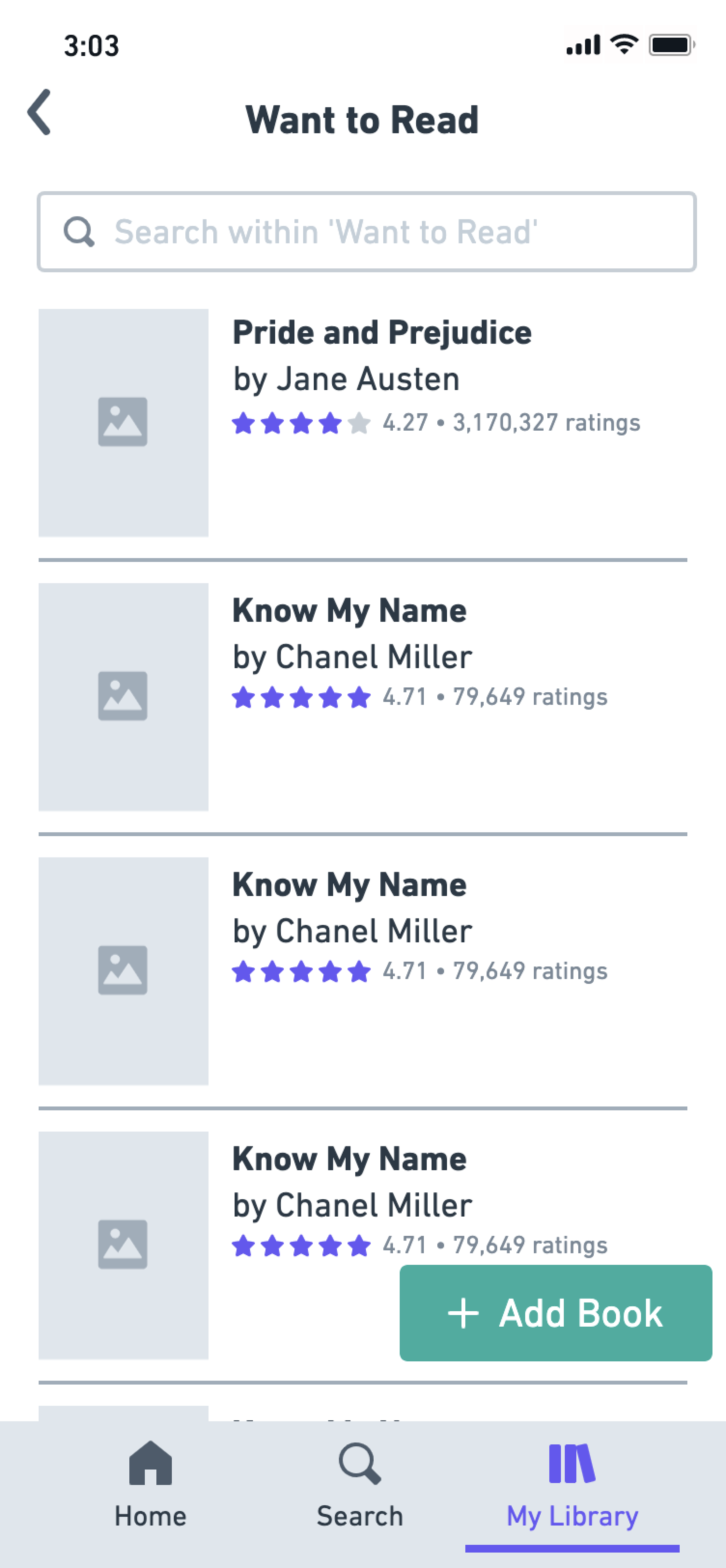
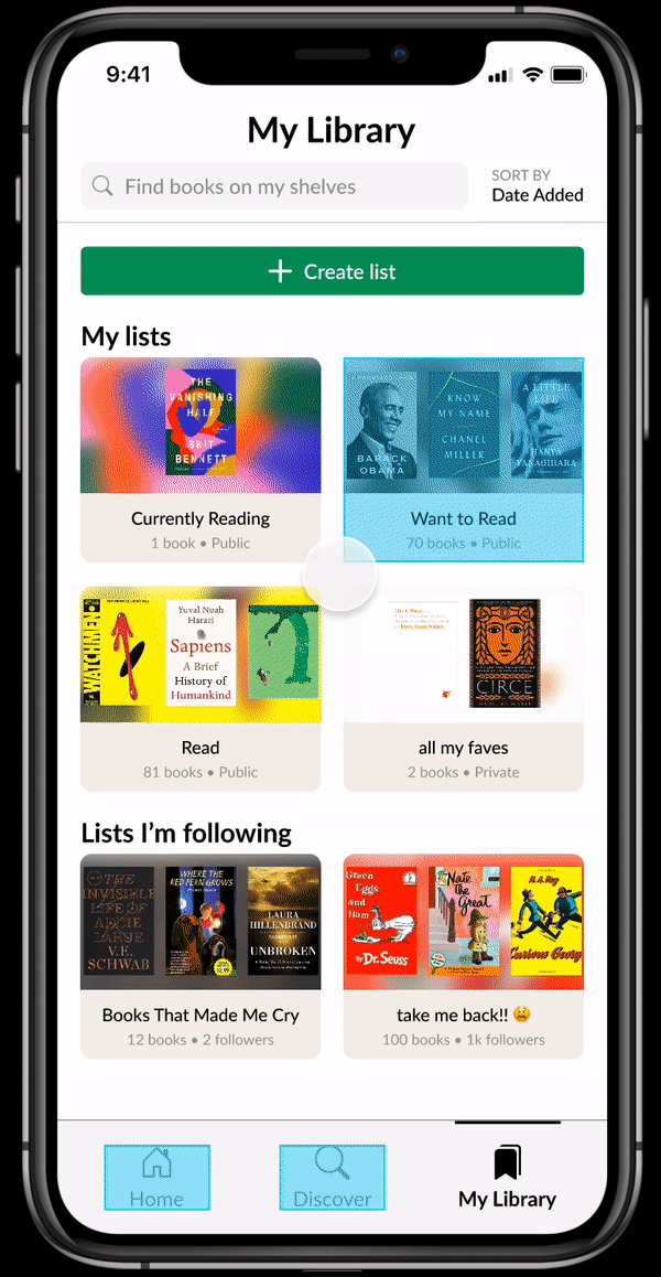
Finally, my redesign of the library page (currently in the app as "My Books") was to make the acts of viewing, creating, and modifying collections as intuitive as possible. Similarly, I wanted to make the task of tracking books within these collections seamless. My redesign features a new view of collections, which emphasizes immediately pertinent information about each collection.
Within each collection, I've redesigned the UX to make it much simpler to add books through a clear button at the top. I've also made the book previews more functional by allowing users to remove them easily from a list from a three-dot menu. In this menu, users can also find a feature to add private notes to books, which I felt bridged a gap between readers' desires to track specific thoughts about books in more private way than in public reviews.
You can check out my prototype here and below.
Takeaways
This was my first independent case study and redesign, which I finally felt comfortable pursuing due to my more recent experiences refining my own design approach. I had a blast embarking on this week-long side project, partly because I am a book/Goodreads fanatic and mostly because the process was so rewarding. I am proud of my growth as a designer but know that there is a lot to learn and improve upon. With more time, I would have liked to conduct more user testing to iterate on the UX, consider the book details pages and interactions within those, and fleshed out the interactions on the screens that I did design.
Shoutout to Ben Demonbreun, my friend and fellow Goodreads enthusiast who supported me from start to finish with this project!